Personal branding that establishes a connection
This project is a complete personal brand I developed from the ground up, focused on creating a fun, easily identifiable logo and a strong visual identity. The goal is to build a recognizable mark that feels cohesive, versatile, and authentic to the brand’s personality. The final deliverables include a fully designed logo and a comprehensive branding guide to support future use and growth. This is for a personal brand.
It starts with an spark to create
Tools Used:
Adobe Illustrator – for creating the logo and vector assets
Adobe Photoshop – for mockups and photo-based applications
Adobe InDesign – for layout and design of the branding guide
Client
Nicole
Year
1/9/2025
Challenge
The main challenge in this project was finding a concept that felt genuinely personal to me while still maintaining a professional, polished identity. I needed to balance emotional meaning—such as incorporating the poppy symbol connected to my grandmother—with a design approach that would be versatile, modern, and suitable for use across different platforms. Creating something that was both expressive and professional required careful exploration, refinement, and thoughtful decision-making throughout the process.
Straightforward
My goal was to create a personal brand that clearly represents who I am as a designer, combining creativity with professionalism and strong visual clarity.
Versatile
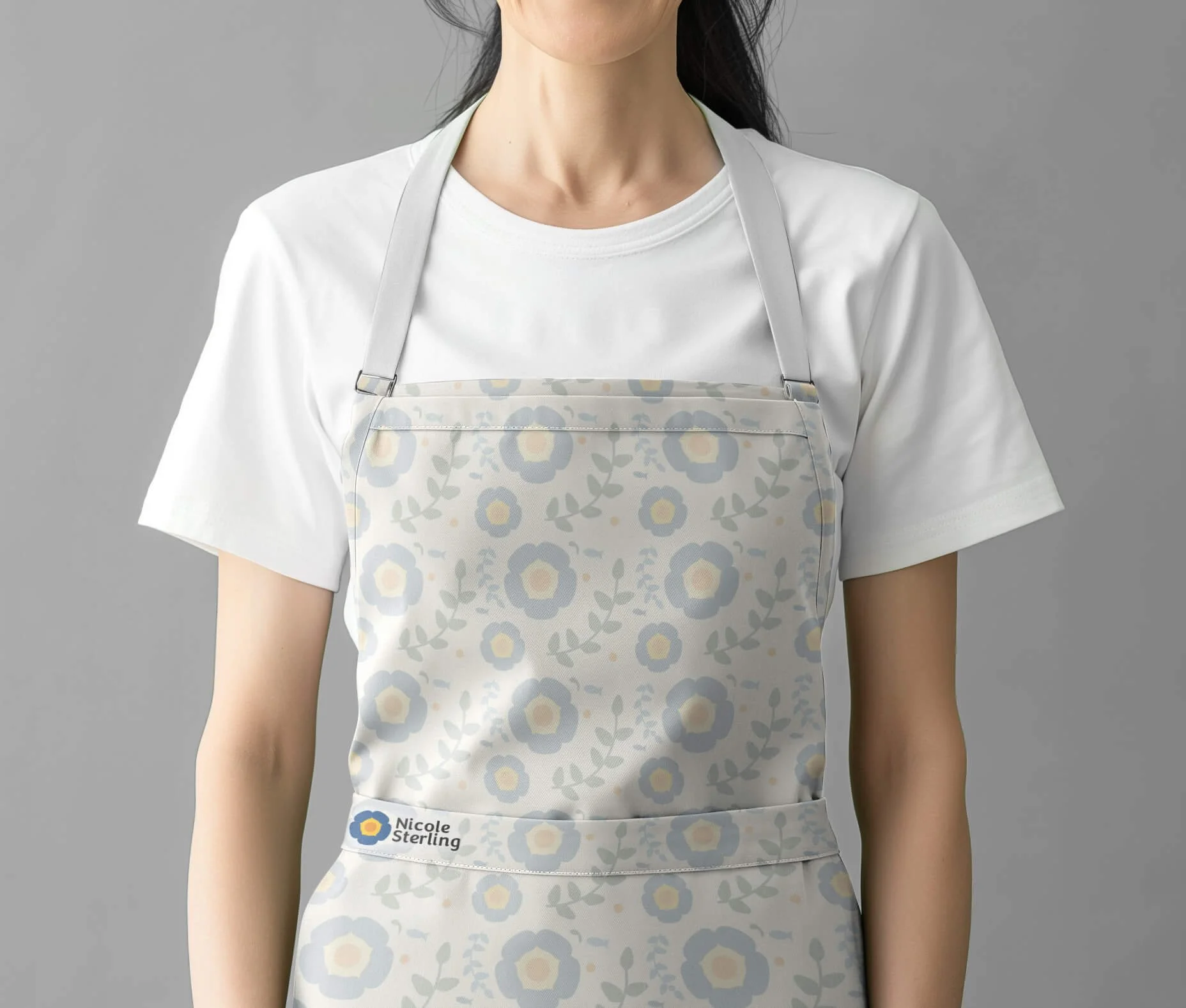
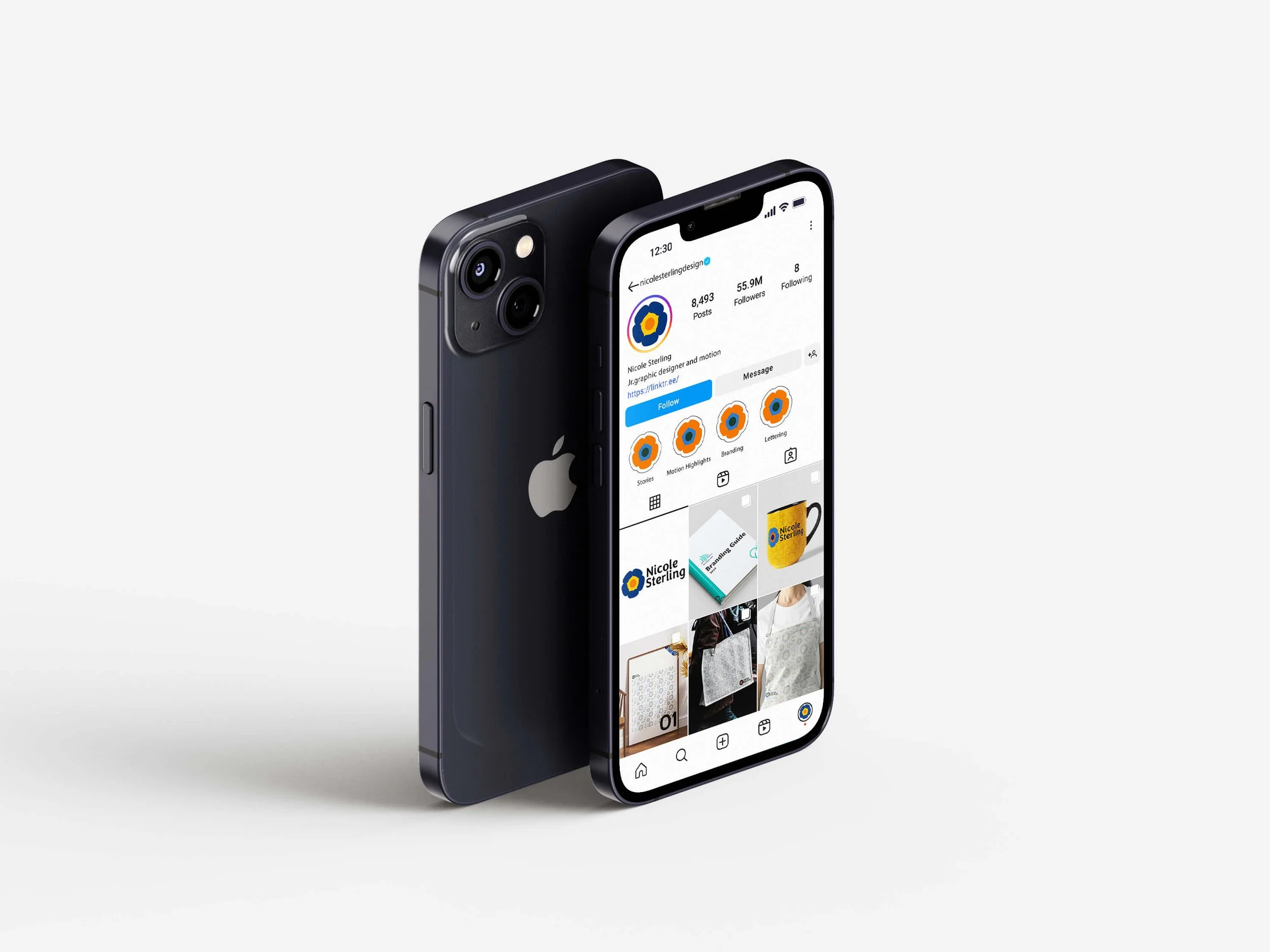
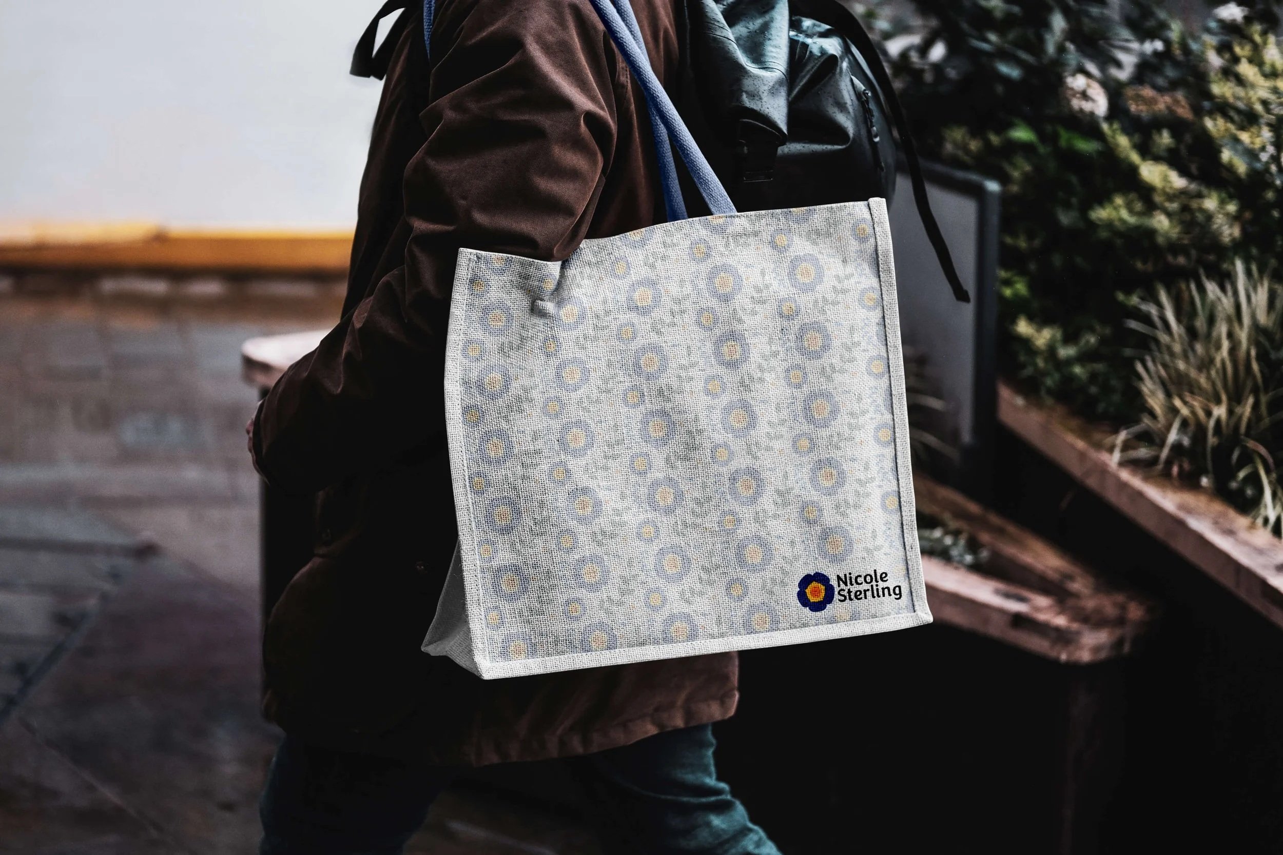
The logo and visual system were designed to work seamlessly across multiple platforms, including web, social media, portfolios, print, and motion, allowing the brand to grow and adapt over time.
Recognizable
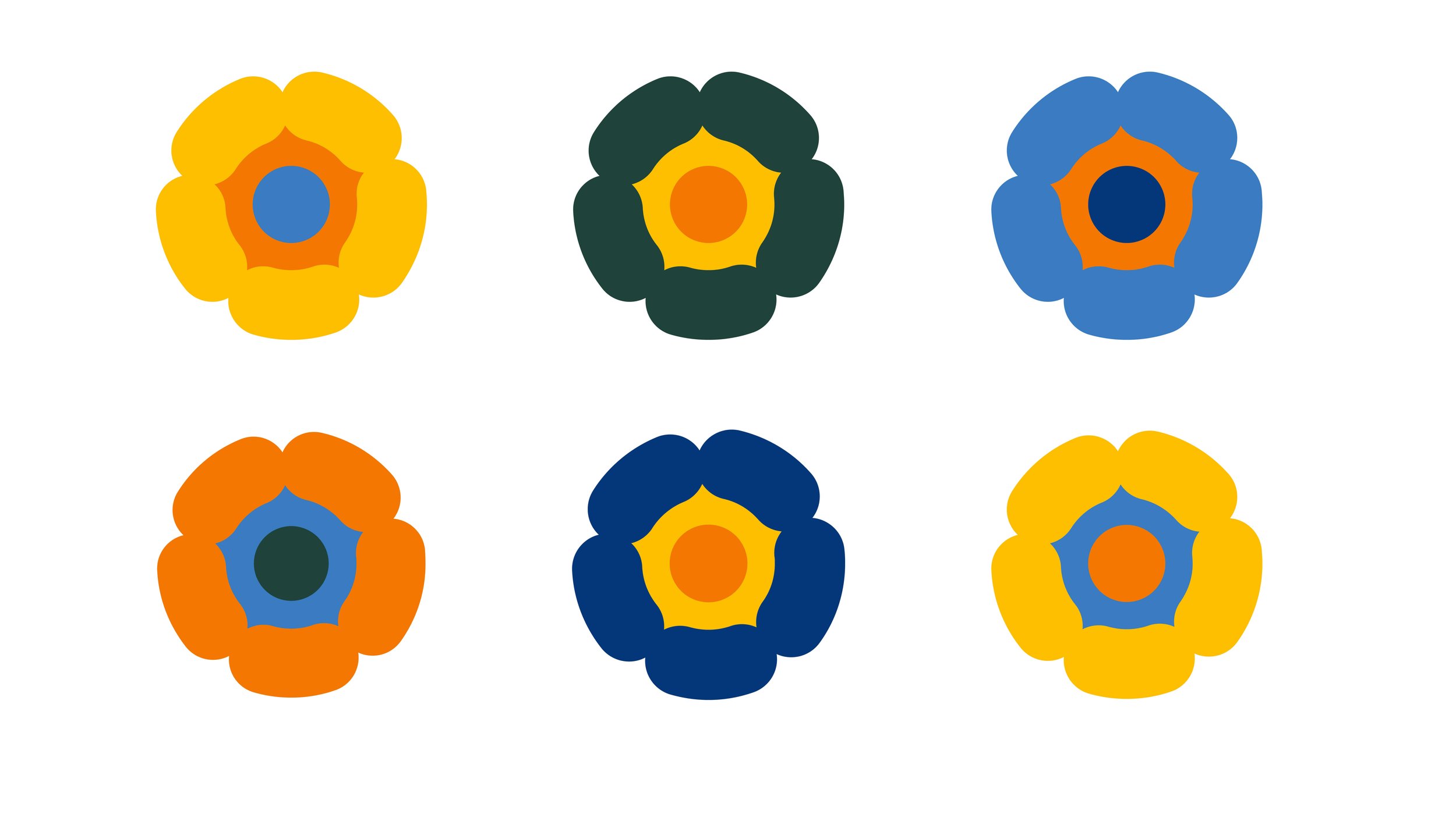
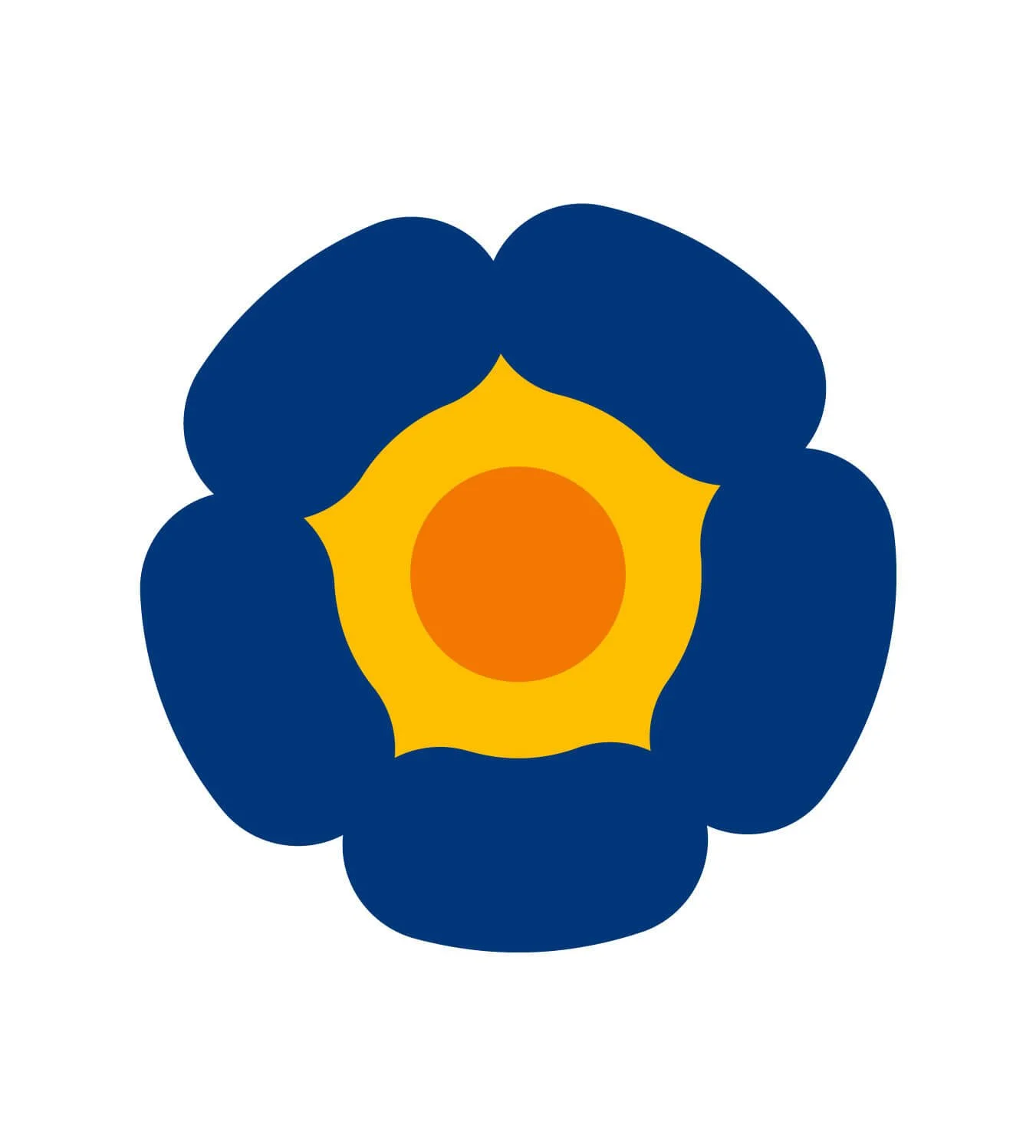
The poppy symbol was chosen as the core mark to create a distinctive and memorable identity, while also carrying personal meaning through its connection to my roots.
Accessible
Accessibility played a key role in the design decisions, ensuring the brand is legible, scalable, and easy to understand for a wide range of users and real-world applications.
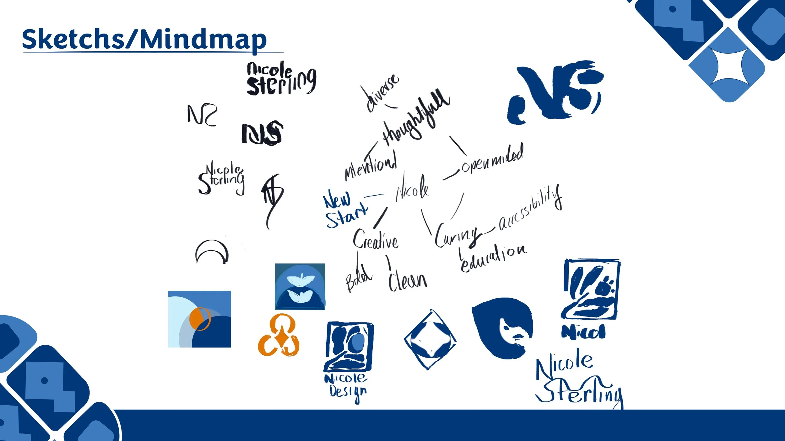
Research
The process began with sketching and mind mapping to explore my interests, personality, and the type of connection I wanted my brand to create. This stage helped define the emotional direction of the identity and clarify how I wanted to present myself as a designer before moving into digital development. It also gave me the freedom to sketch whatever came to mind, make mistakes, experiment openly, and grow creatively without limitations.
Development
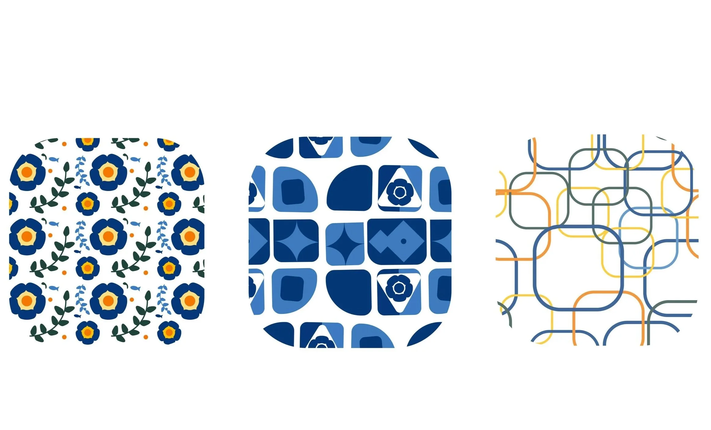
Using insights from my sketches and concept exploration, I began refining visual directions that balanced personal meaning with a clean, modern, fun aesthetic. I focused on creating a logo and system that felt expressive yet professional. The chosen direction was then developed digitally in Adobe Illustrator and refined through multiple iterations, testing for clarity, scalability, and consistency. Once this stage began, the typeface Congenial was chosen as it balanced a clean appearance with a fun, approachable character.
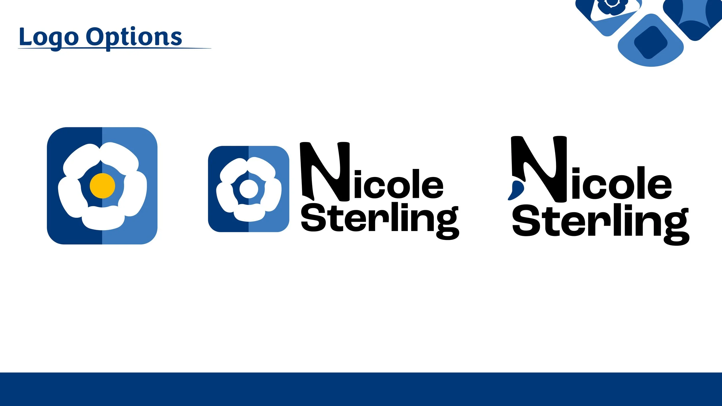
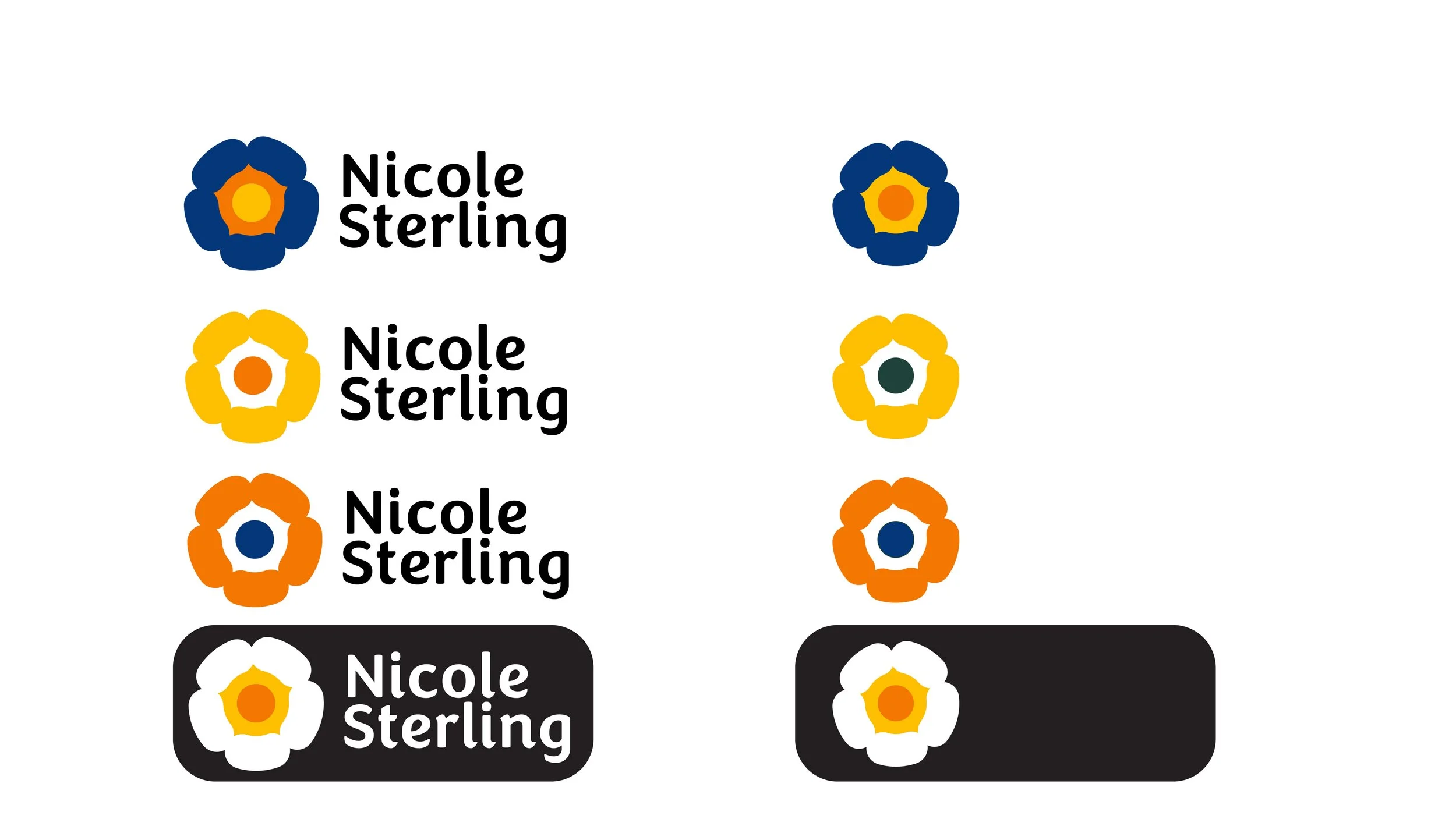
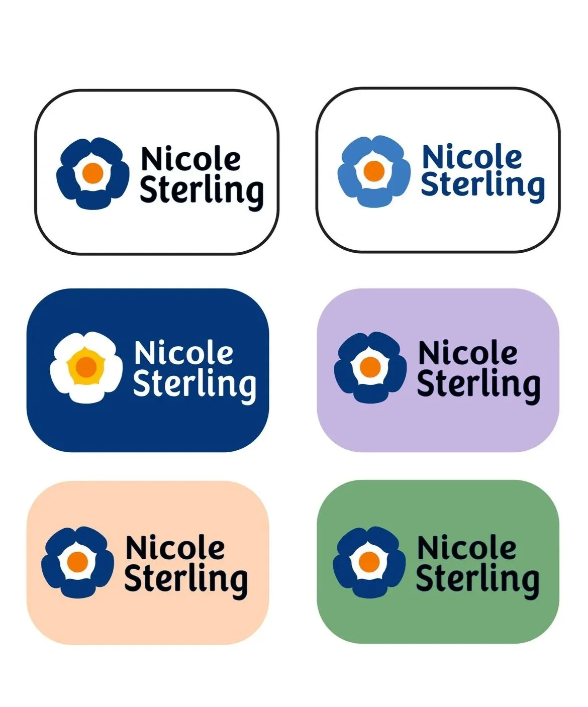
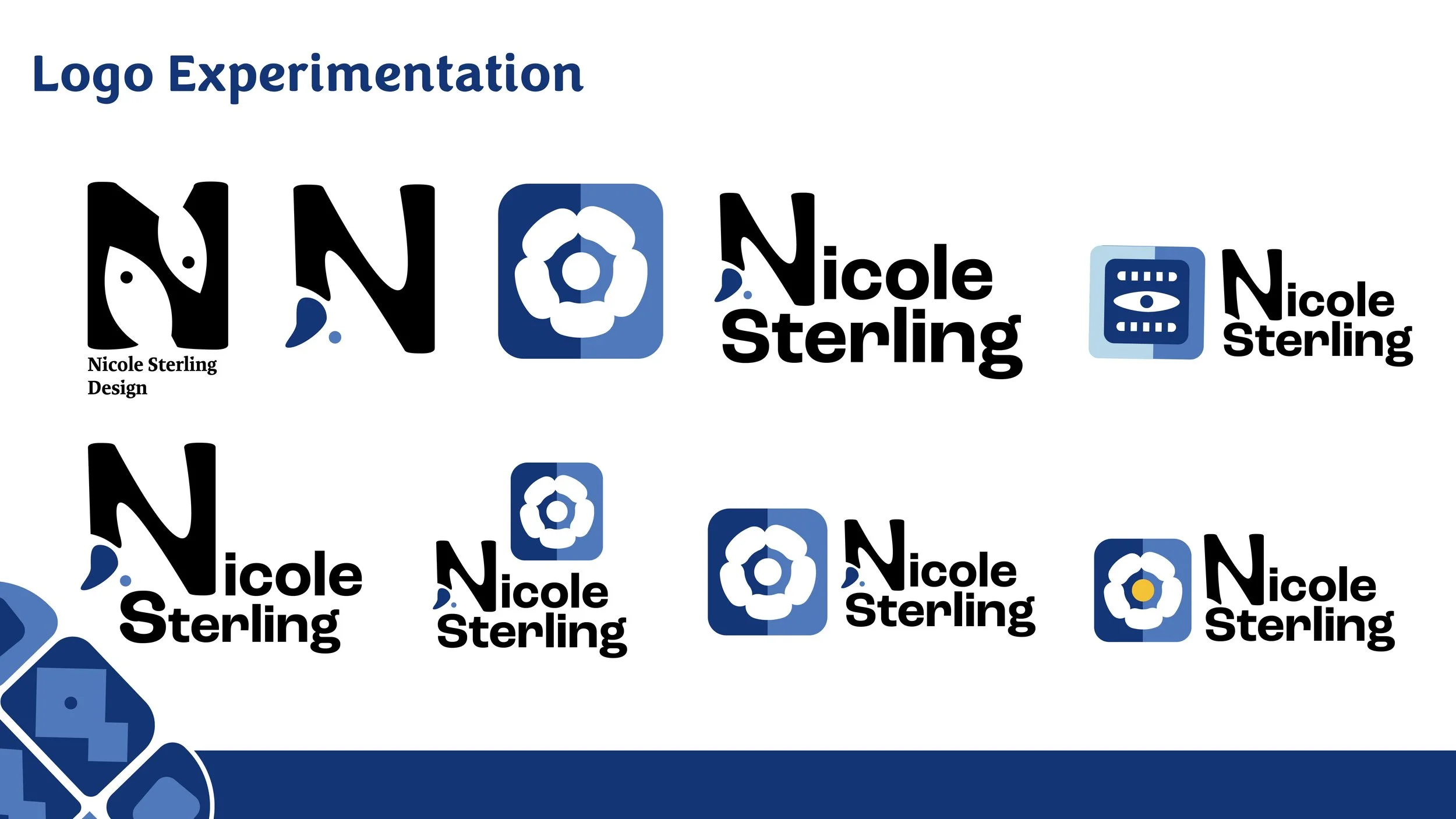
Logo Options
Multiple logo variations were explored to test different layouts, proportions, and typographic pairings. This process helped further narrow down the strongest directions and identify what best suited my personal brand. Feedback was then used to guide refinements, leading to the final iterations of the logo system. These explorations also informed decisions around spacing, hierarchy, and scalability for responsive use.

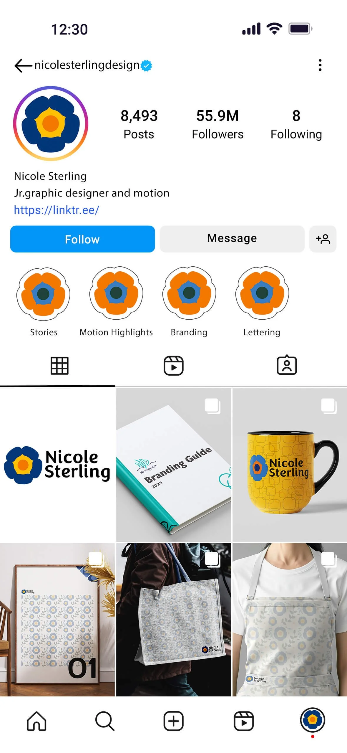
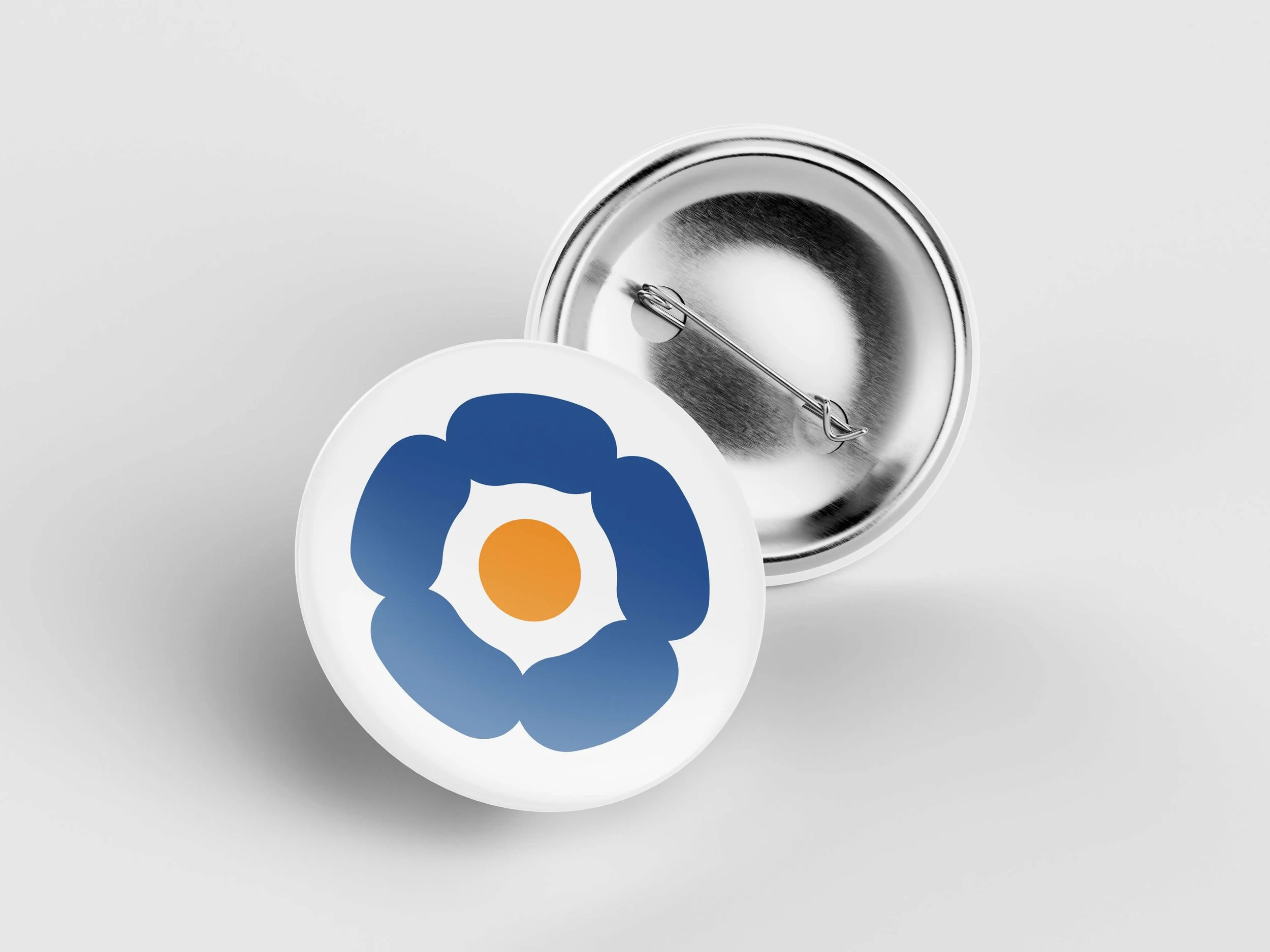
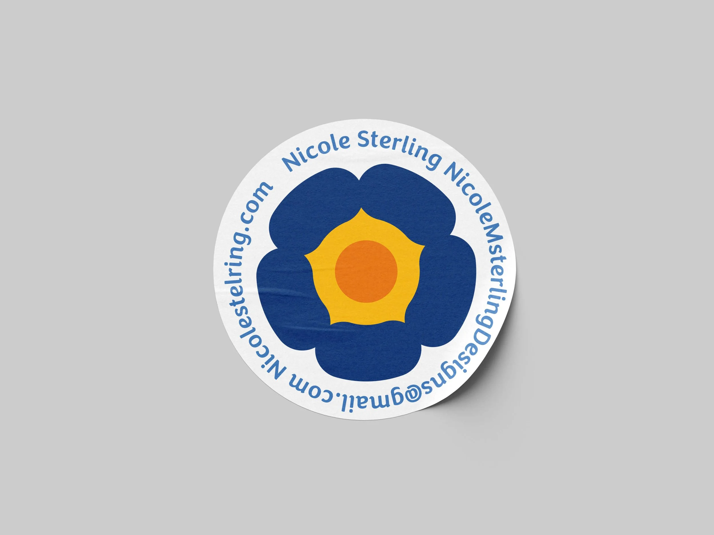
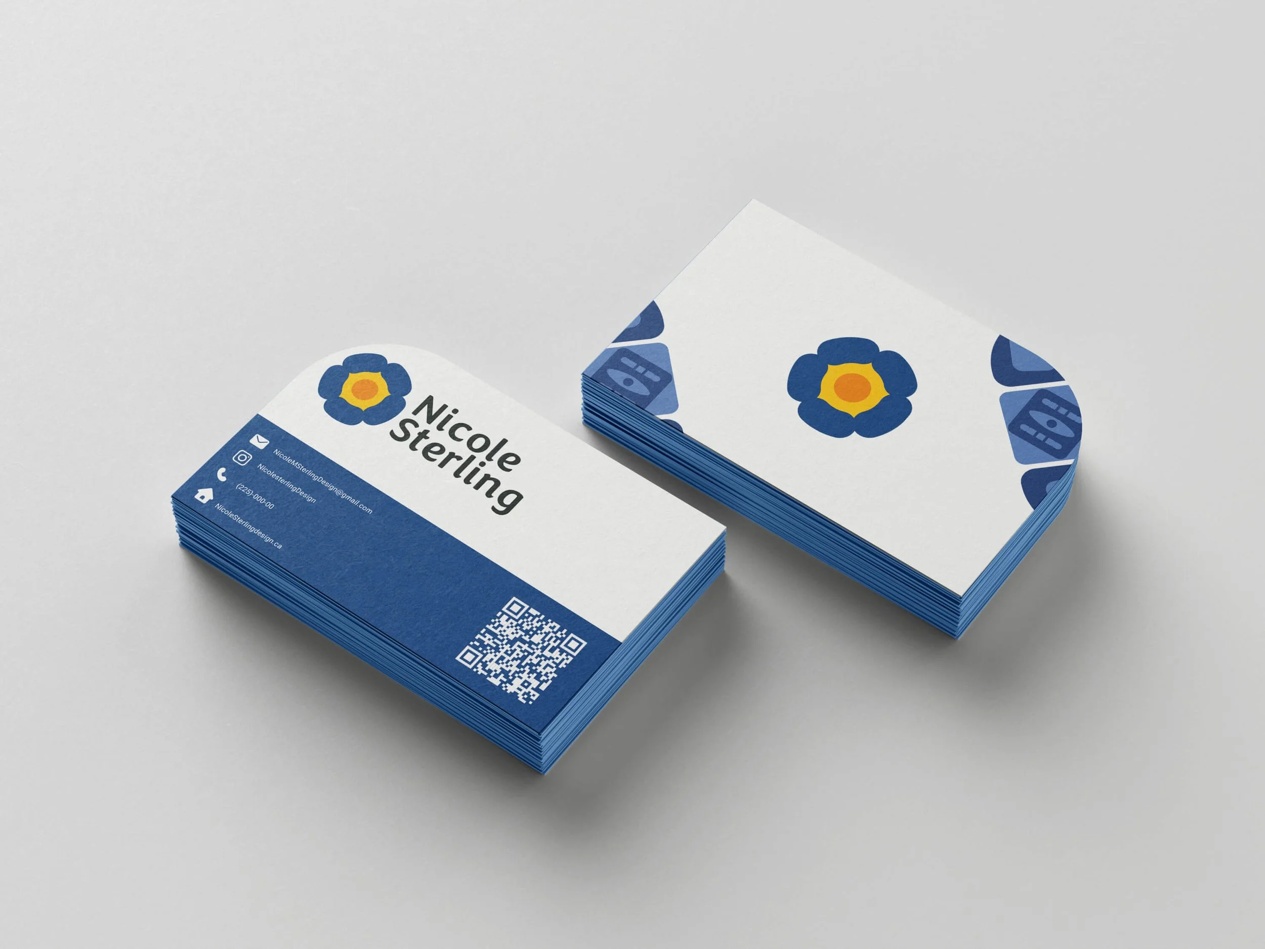
Final Logo
Designed in a clean, minimal style, the logo feels modern, expressive, and approachable while maintaining a professional tone. The poppy was given its own space rather than being contained in a box, allowing the mark to breathe and feel more organic. My first and last name were stacked to improve visual balance and readability across layouts. Its simple form makes the logo highly versatile, working seamlessly across digital platforms, print applications, and motion. This solution successfully meets the goals of the project by being personal, flexible, and memorable.