This project is a complete rebrand of Marinescapes, focused on refreshing the logo and overall visual identity to better appeal to a younger, more diverse audience. The goal is to modernize the brand while maintaining its reputation for quality and knowledge. The rebrand will include a newly designed logo and a comprehensive branding guide to help the new owner relaunch the business .
Marinescape- rebranding that is to the point.
It all starts with an idea
Tools Used:
Adobe Illustrator – for creating the logo and vector assets
Adobe Photoshop – for mockups and photo-based applications
Adobe InDesign – for layout and design of the branding guide
Client
Marinescapes
Year
1/9/2025
Challenges
The core challenge was to redesign the Marinescapes logo in a way that modernizes the brand while retaining its established identity. The logo needed to strike a balance between being fun and engaging, especially for a younger demographic. while still maintaining a sense of professionalism and trust that existing customers value.
Fun yet professional
The new logo balances playfulness with a clean, modern aesthetic to appeal to both younger customers and marine hobbyists who value credibility and expertise.
Versatile
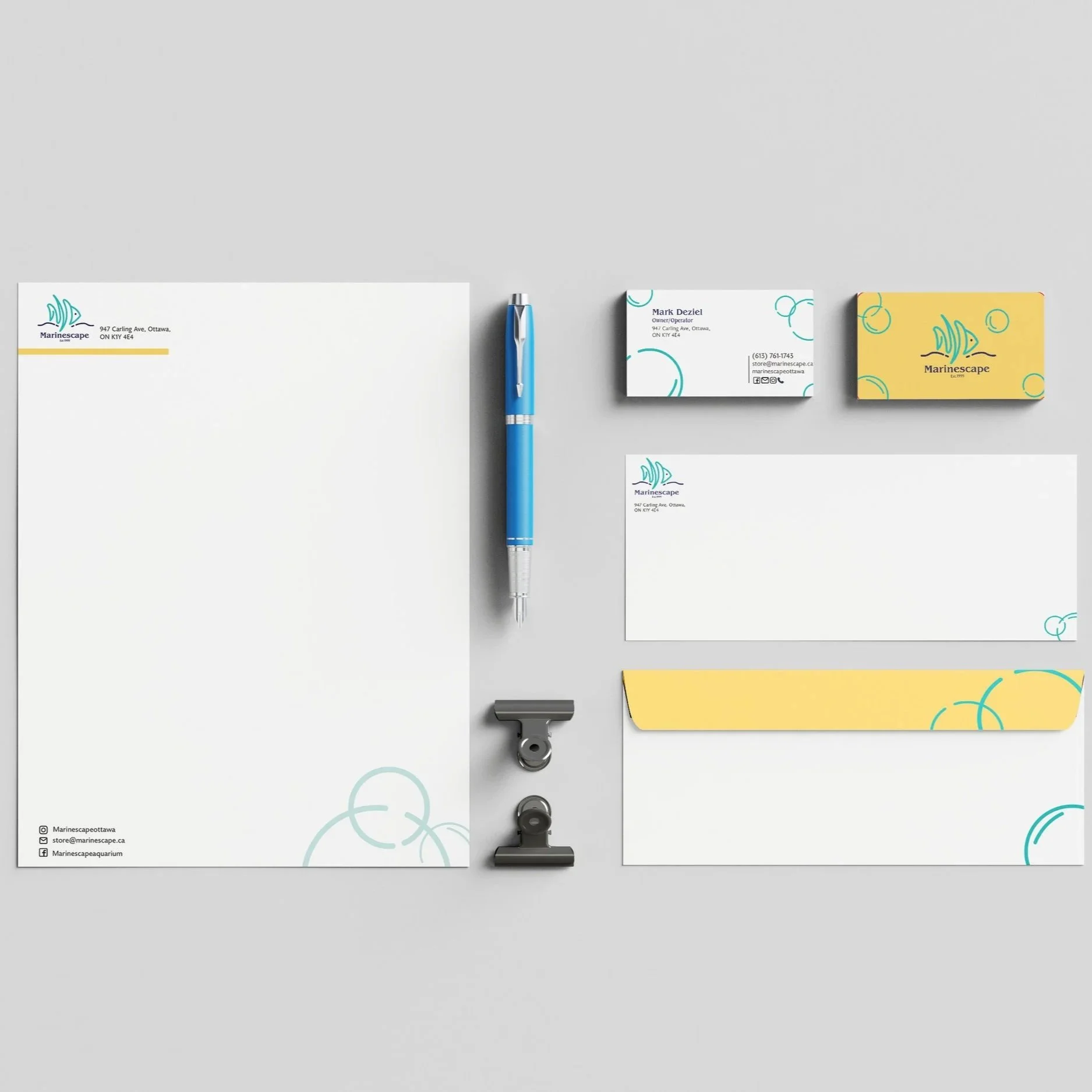
The logo and branding elements are designed for use across various platforms, including web, social media, packaging, signage, and print.
Recognizable
Key visual elements were carefully considered to maintain continuity with the original brand and ensure recognition among the existing customer base.
Accessible
Unlike the previous logo, which was outdated and difficult to use, the new identity is scalable, legible, and adaptable for all branding needs.
Research
The rebranding process began with an in-person visit to Marinescapes to identify the core issues with the existing logo, such as its outdated style, poor scalability, and limited usability across platforms. From there, I developed mood boards, gathered visual inspiration, and conducted background research to inform the design direction. The rebranding process began with an in-person visit to Marinescapes to identify the core issues with the existing logo, such as its outdated style, poor scalability, and limited usability across platforms. From there, I developed mood boards, gathered visual inspiration, and conducted background research to inform the design direction.
Development
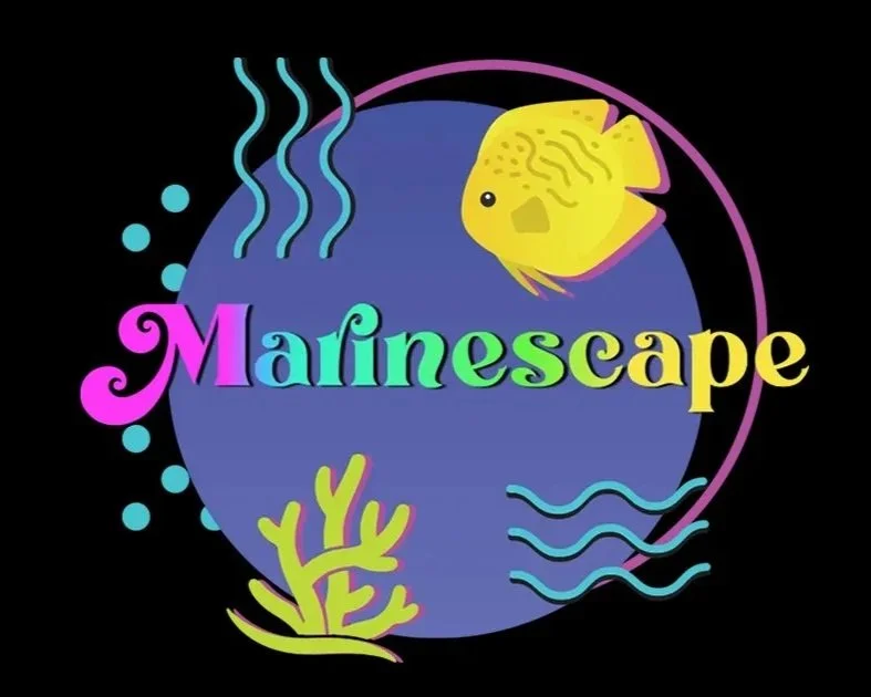
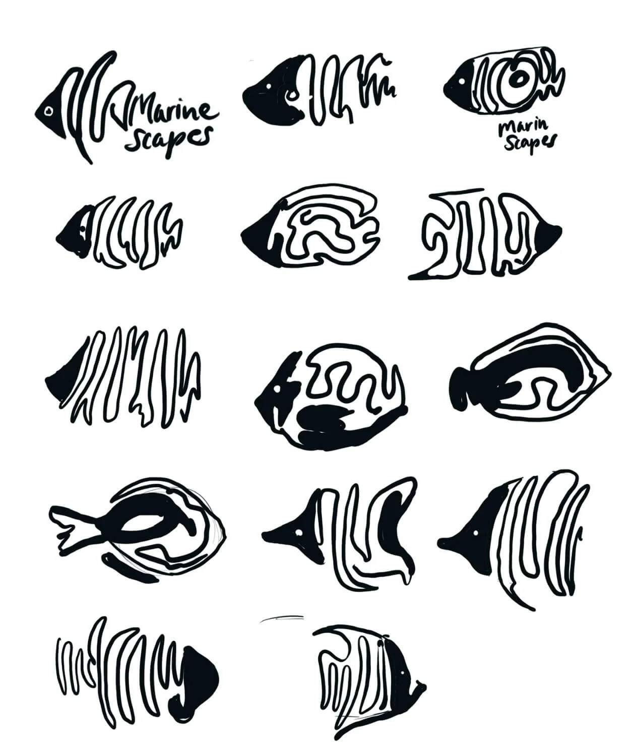
Using mind maps and concept exploration, I began sketching and refining ideas, ultimately focusing on a modern and minimal one-line fish illustration that felt both playful and professional. This concept was chosen for its ability to convey the marine theme while remaining clean and versatile. I then moved into the execution phase, where the logo was digitally developed and refined in Adobe Illustrator, with various iterations tested for scale, clarity, and visual impact.
Final refinement
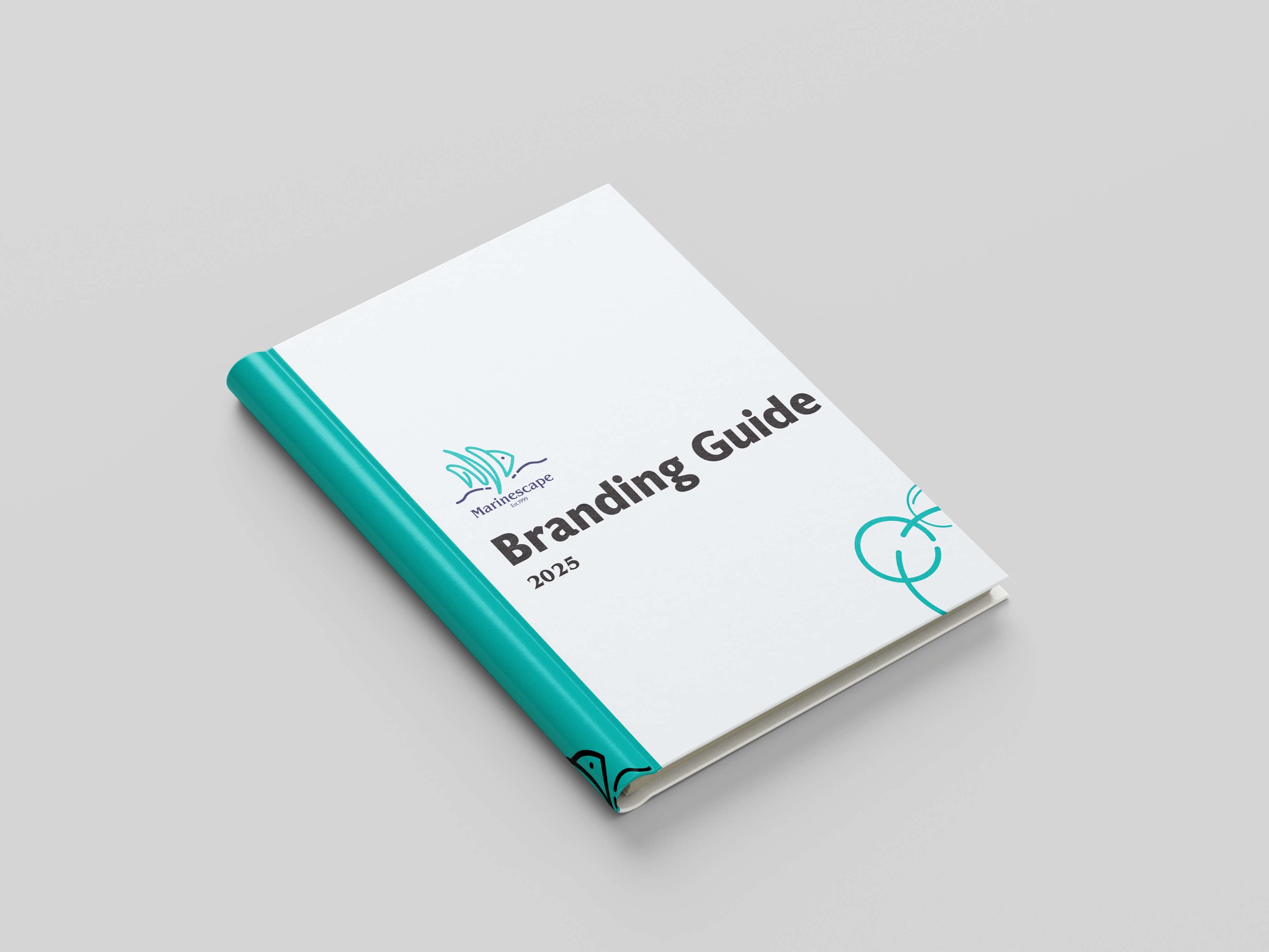
Typography, color palettes, and logo variations were explored to build a cohesive identity system. Real-world mockups were created in Photoshop to visualize the brand in use, and the final branding guide was assembled in InDesign to provide a clear framework for future applications.
Final refinement
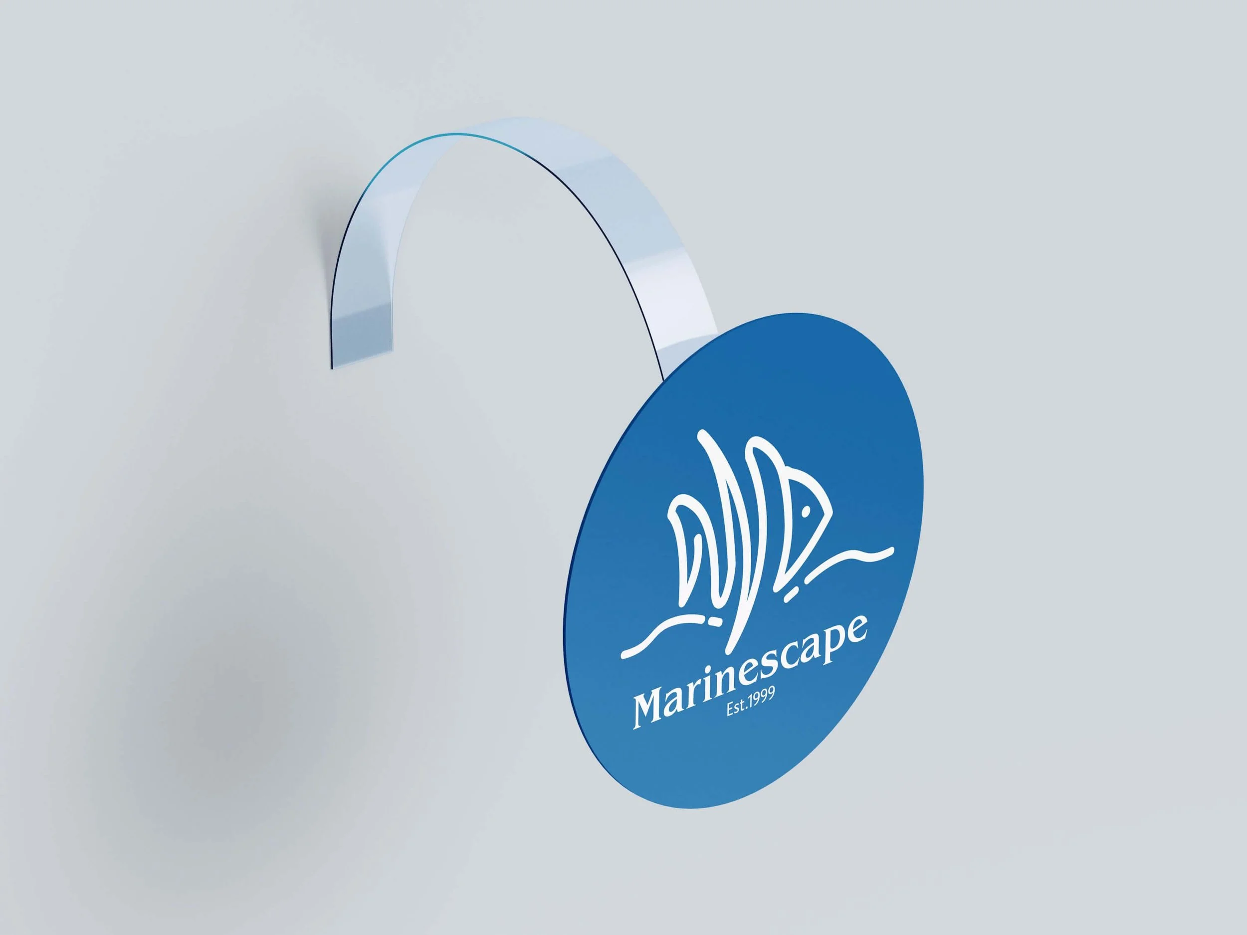
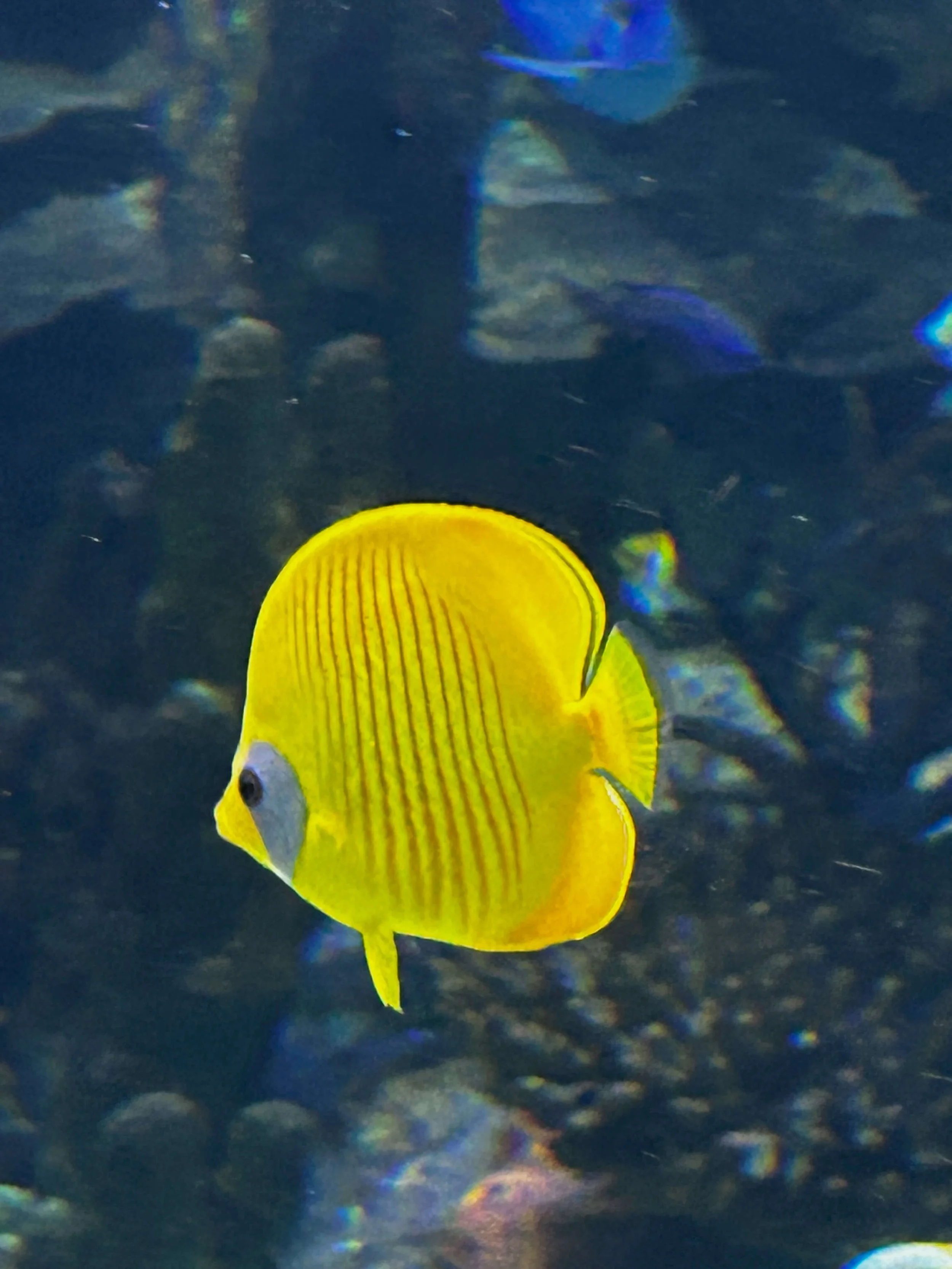
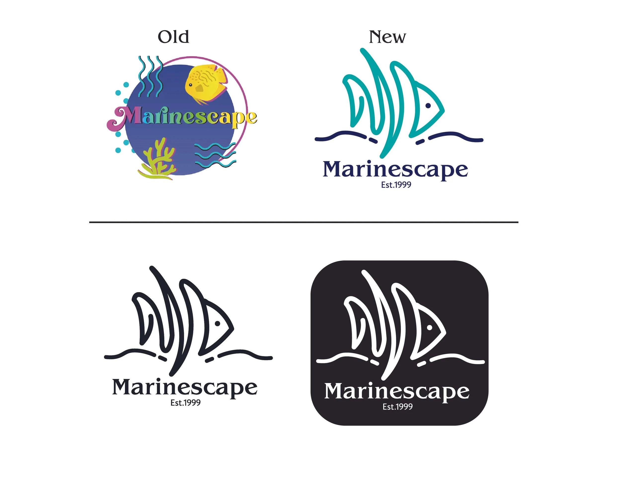
The final logo is inspired by the Moorish Idol, a recognizable saltwater fish featured in popular films, helping create an instant connection with customers. Designed in a one-line drawing style, the logo feels dynamic, creative, and modern—perfect for attracting a younger audience while maintaining a professional look. Its clean and minimal form makes it highly versatile, working well across icons, stickers, signage, and digital platforms. This solution effectively addresses the original challenges by being simple, flexible, and memorable.
-
![Marinescape Price tag]()
Marinescape Price tag
-
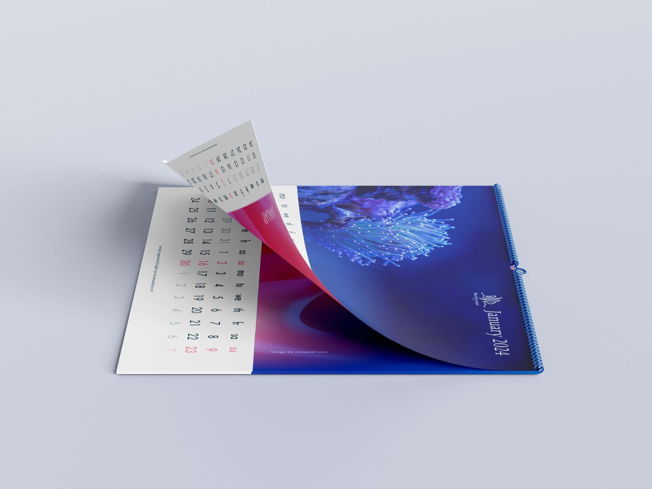
![Marinescape calendar]()
Marinescape calendar
-
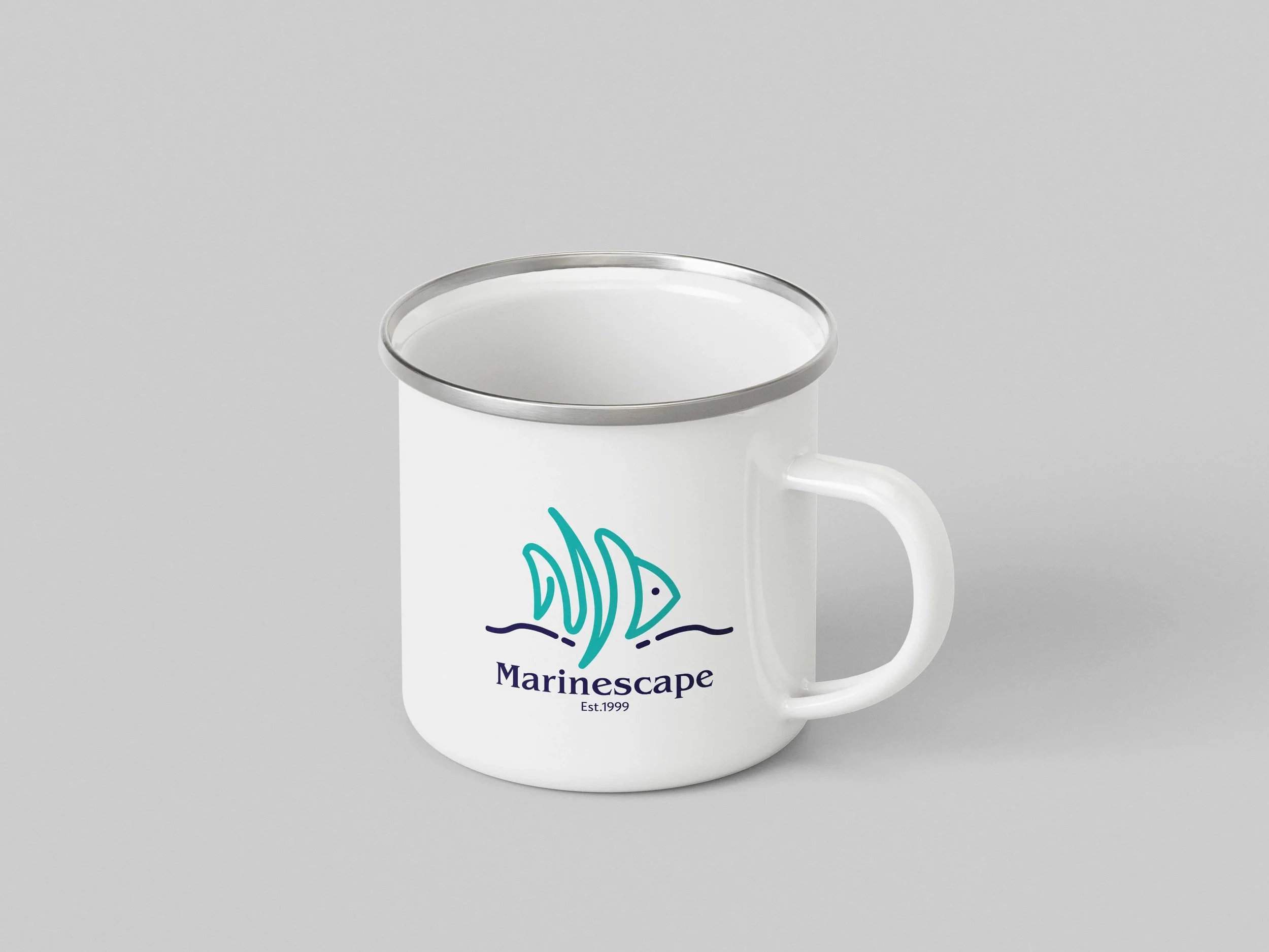
![White mug with a marine-themed logo, including a stylized fish and water waves, with the text 'Marinescape Est. 1999'.]()
mug
-
![A branding guidebook titled 'Mariescape' for the year 2025, featuring a white cover with black and teal accents, a teal spine, and a minimalist illustration of a bird and clouds.]()
branding guidebook