Reimagining Dominion City’s packaging through bold storytelling and local identity.
This project involved designing a beer can label for Dominion City Brewing Co., a craft brewery based in Ottawa, Ontario. The objective was to create a concept that respected the brand’s core values while intentionally exploring a more illustrative and narrative-driven direction than their typical visual style. The result is a pair of concept designs that blend local storytelling with bold, modern visual experimentation.
A story takes form
Tools Used:
Adobe Illustrator – for creating the logo and vector assets
Adobe Photoshop – for mockups and photo-based applications
Adobe InDesign – for layout and design of the branding guide
Client
Dominion City Brewing Co
Year
10/05/2025
Challenge
The main challenge in this project was creating a design that felt fresh and unexpected while still aligning with Dominion City Brewing Co.’s established brand identity. The assignment required pushing beyond their usual minimal visual style to explore a more illustrative and narrative-driven approach, without losing the brand identity. Balancing bold storytelling with functional packaging requirements—such as readability, brand recognition, and regulatory information; required careful exploration, refinement, and thoughtful design decisions throughout the process.
Identity
My goal was to design a beer can label that clearly communicates the product while telling a meaningful local story. The design needed to feel engaging and visually strong, while remaining easy to understand and aligned with Dominion City’s values.
Versatile
The labels were designed for two new flavour concepts, each with its own visual style and narrative direction. While distinct in illustration, colour, and tone, both designs maintain a consistent brand presence, ensuring they feel cohesive within Dominion City’s product line while standing apart as unique offerings.
Recognizable
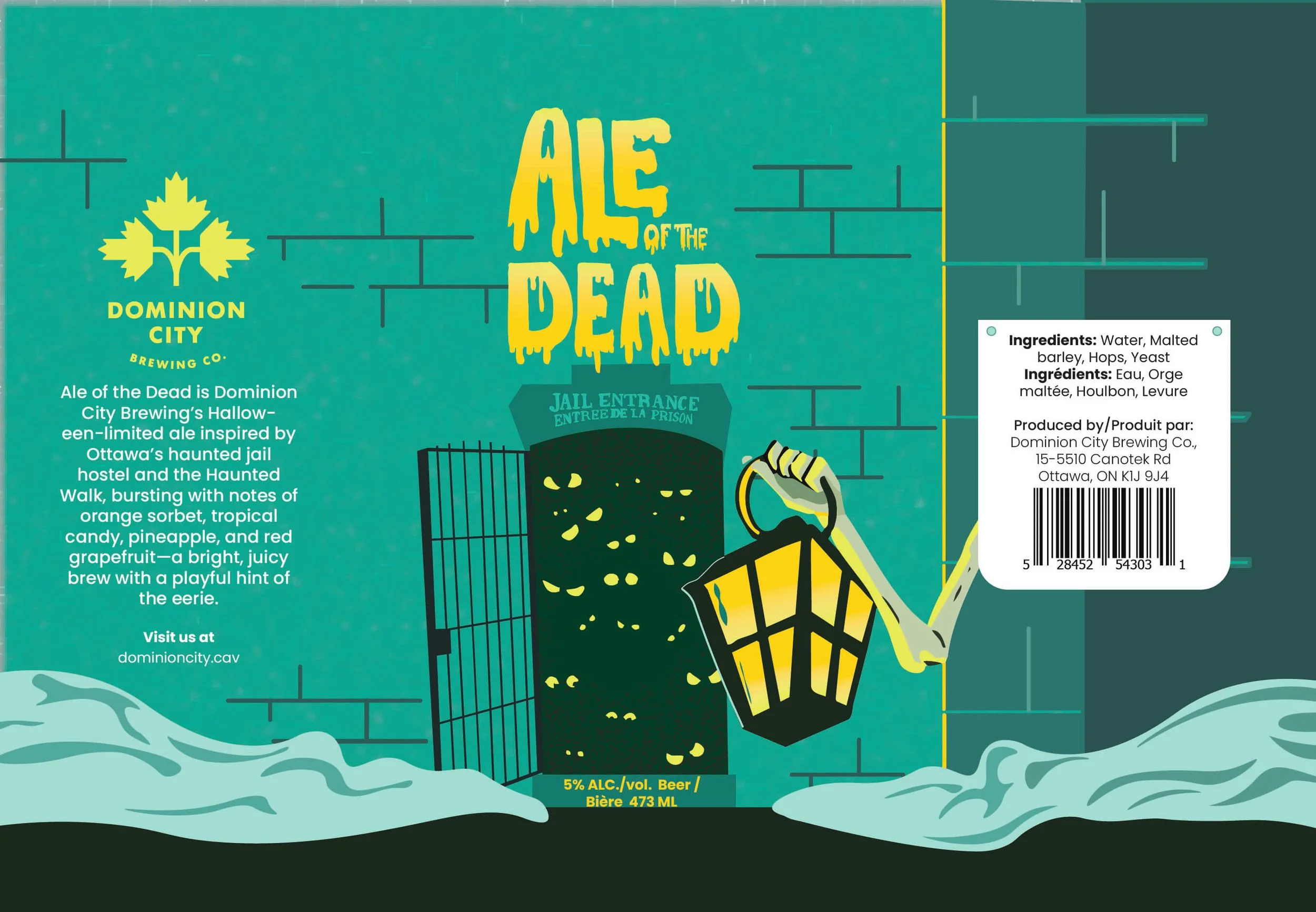
Each concept was rooted in Ottawa’s history and landmarks, creating a strong sense of place and identity. By connecting the designs to familiar local stories the Bytown Locks and the Ottawa Jail Hostel. The cans become memorable and distinct while still feeling authentic to the brand.
Accessible
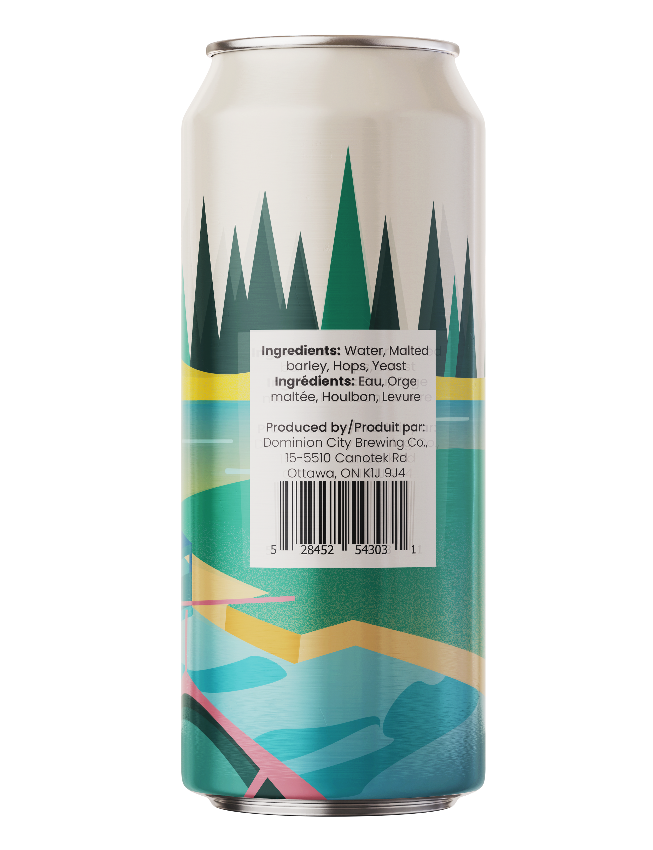
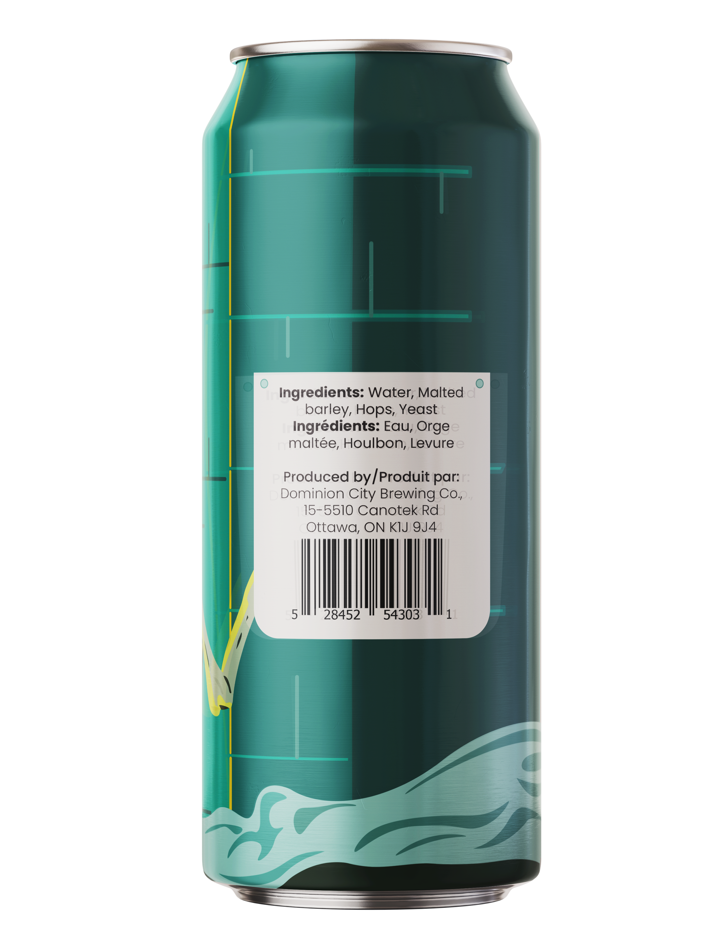
Clear typography, strong contrast, and structured layouts were used to ensure important information such as ingredients, alcohol content, and branding remains legible and easy to navigate. This ensures the packaging is functional, inclusive, and effective in real-world retail environments.
Research
The assignment challenged designers to step outside Dominion City’s usual minimal aesthetic and create something visually distinct while remaining aligned with the brand’s storytelling roots.
Two concepts were developed:
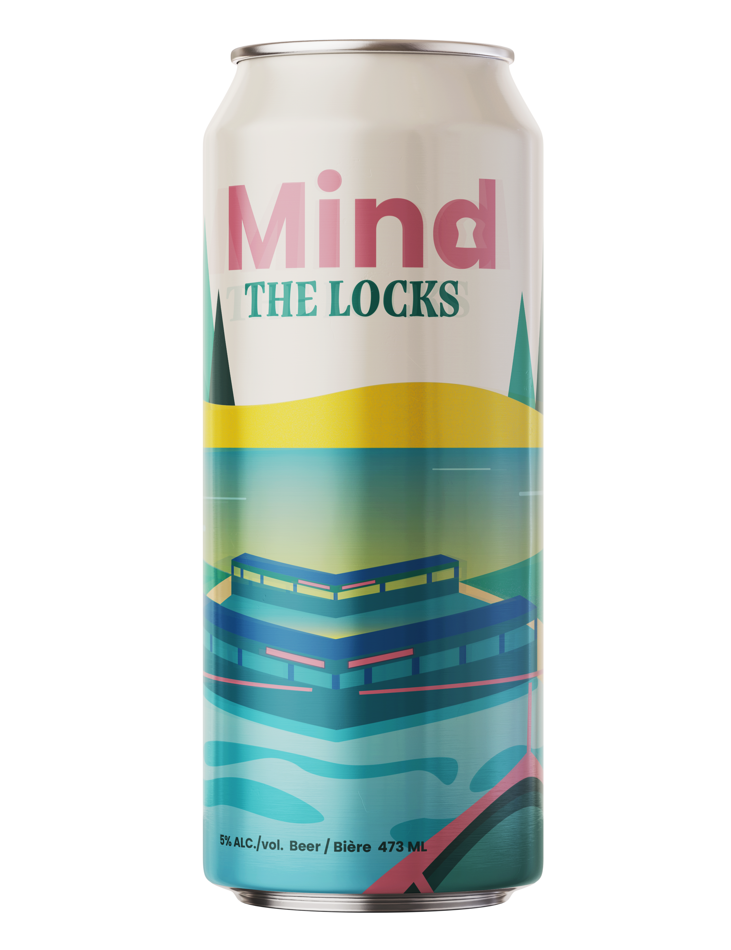
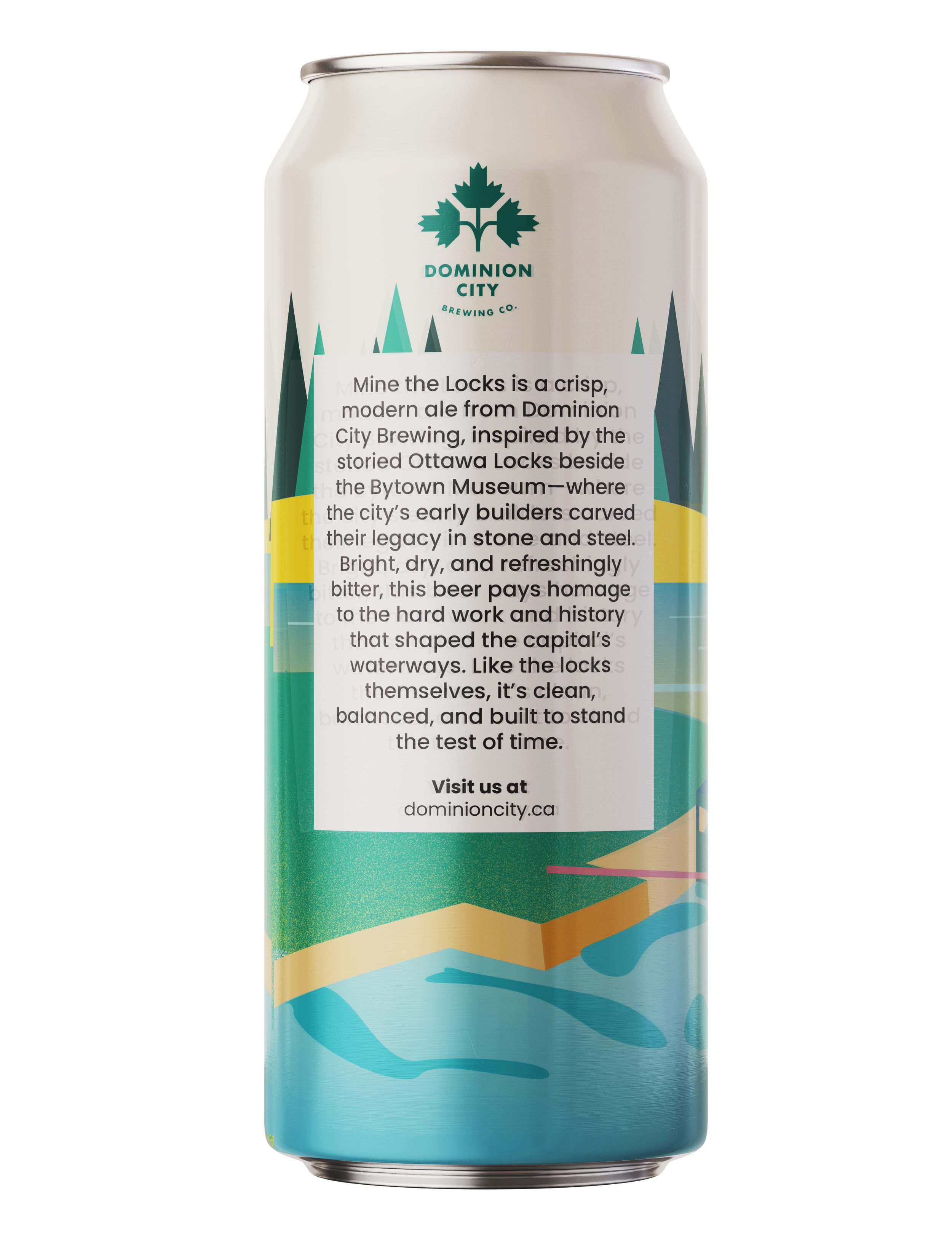
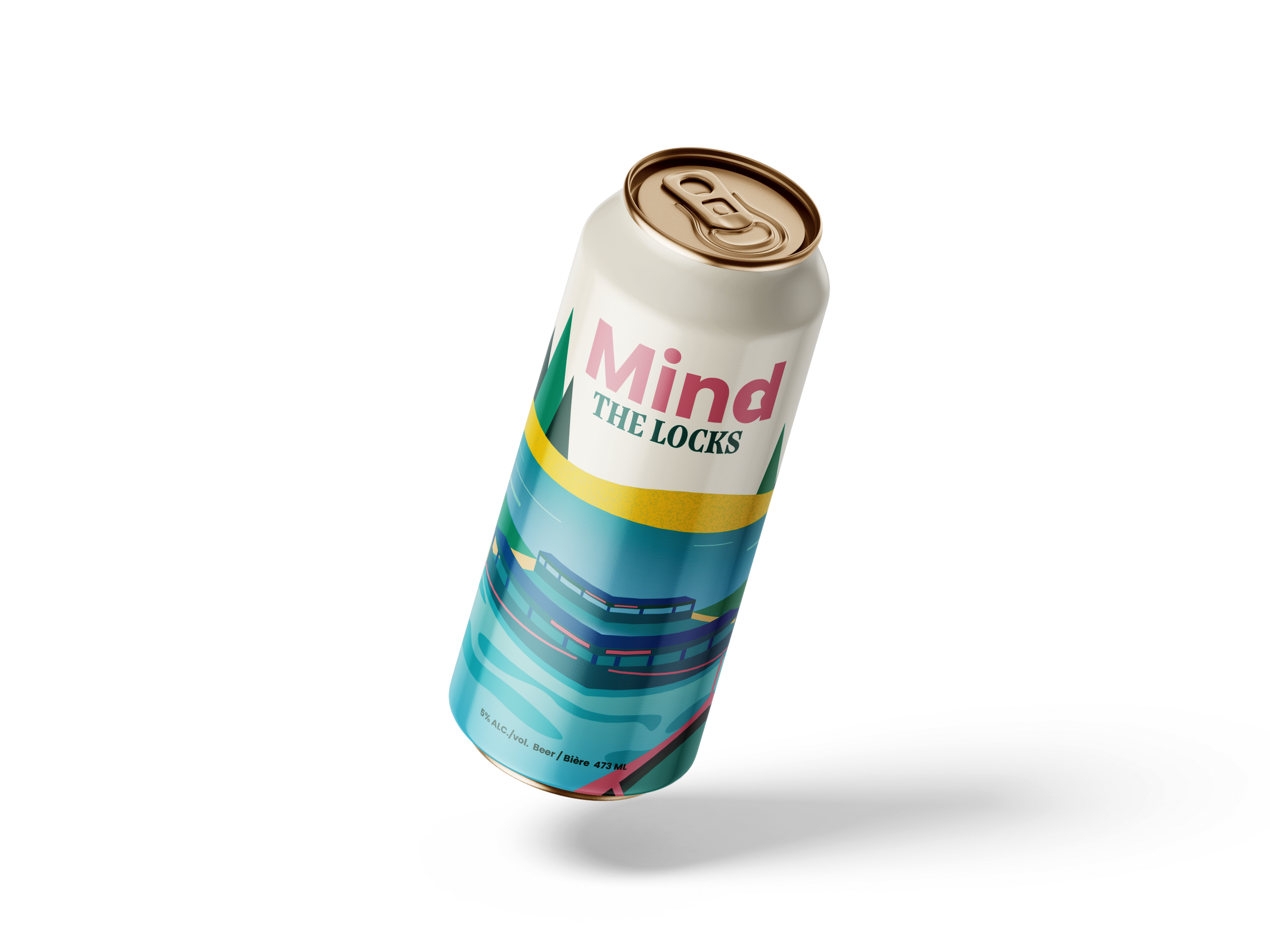
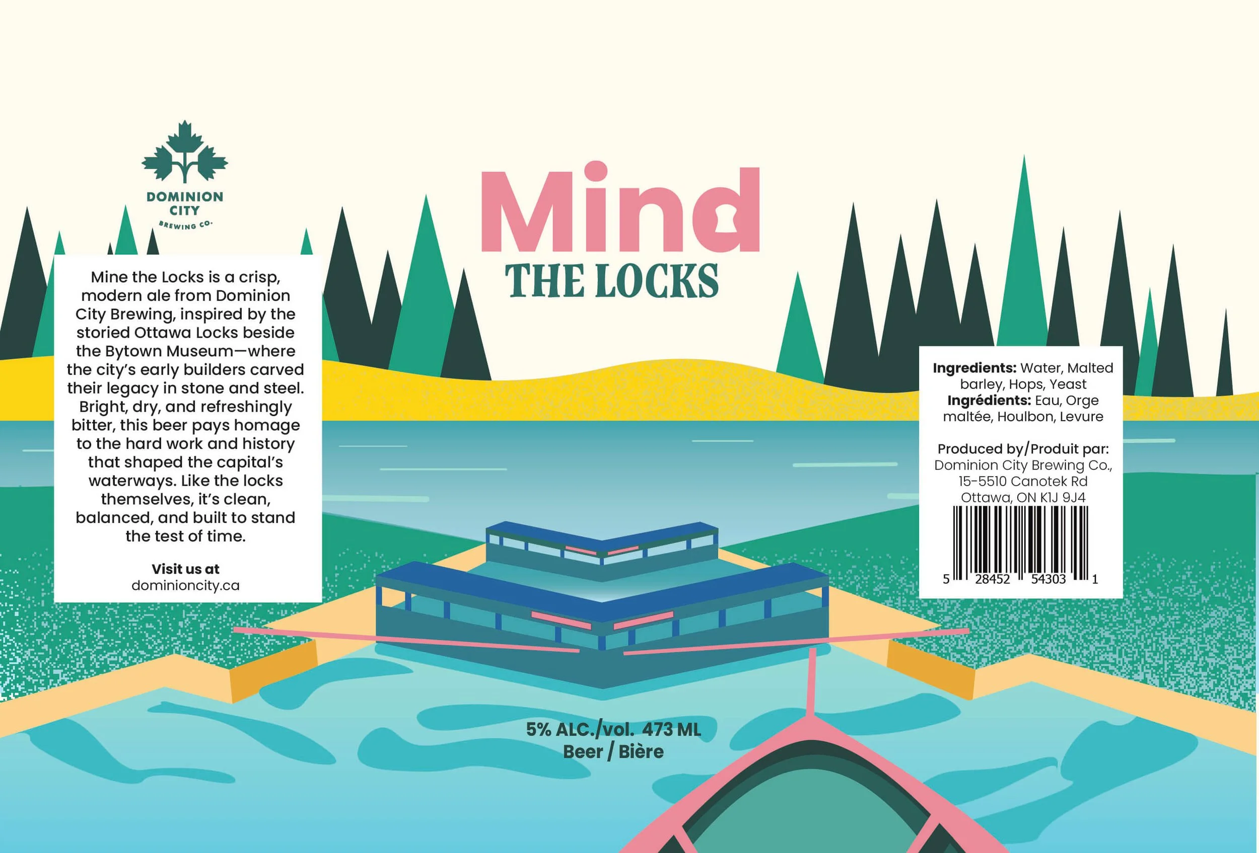
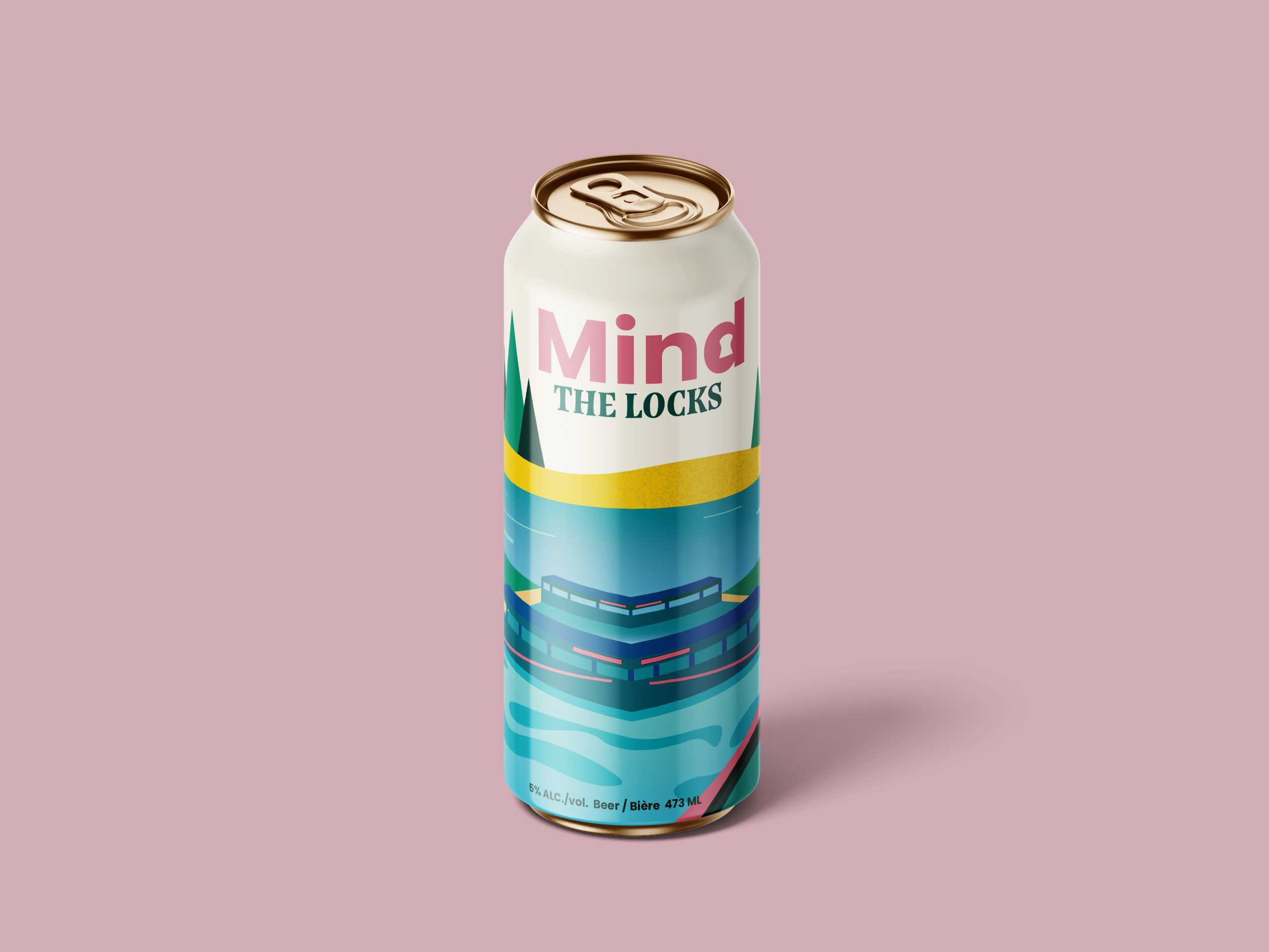
Mind the Locks
Inspired by the historic Ottawa Locks near the Bytown Museum, this concept celebrates the city’s early engineering achievements and waterways. The design uses layered landscapes, geometric structures, and calm, balanced composition to reflect stability, craftsmanship, and heritage.
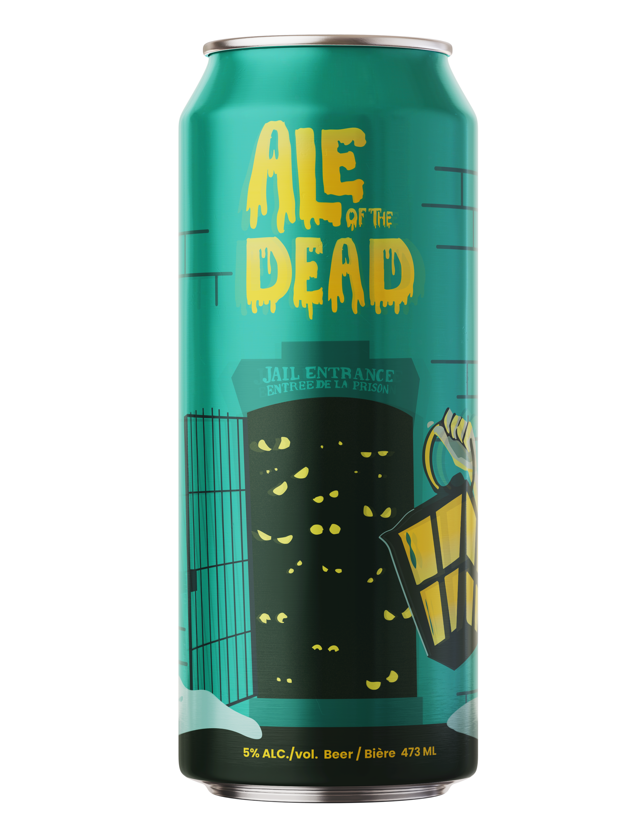
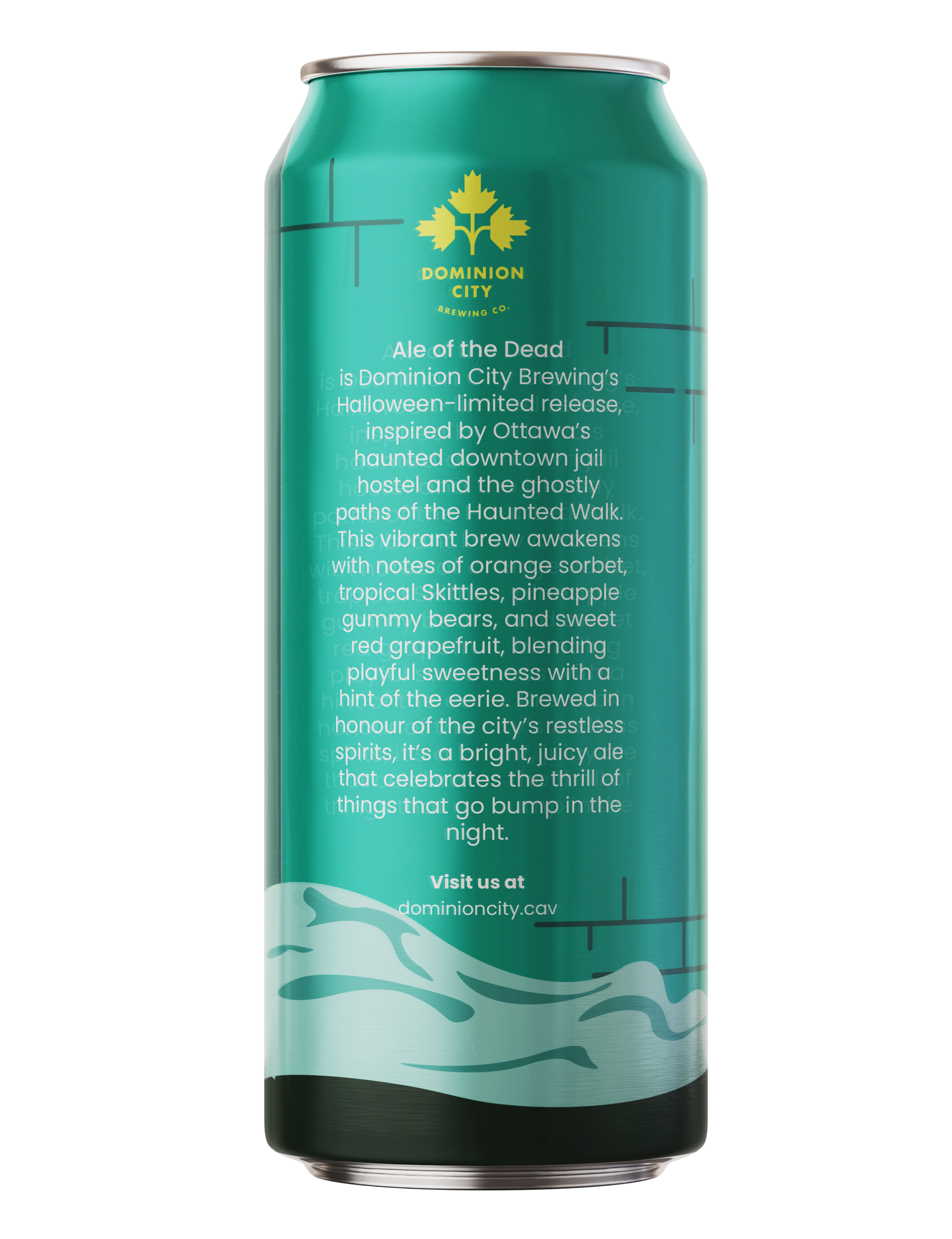
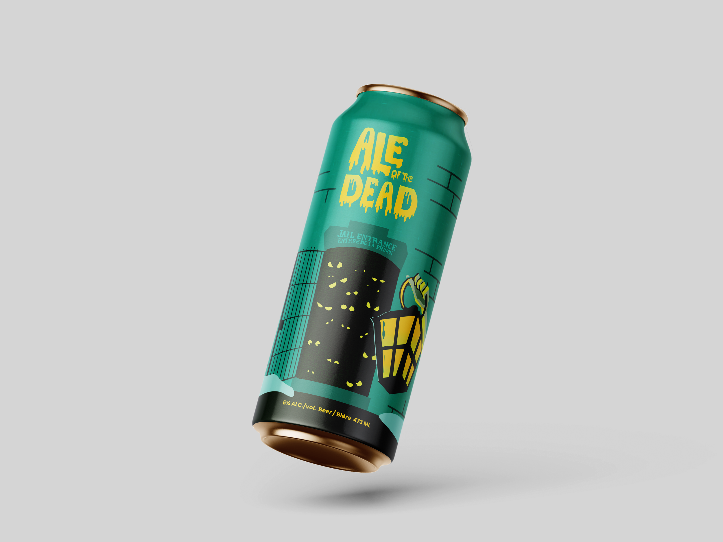
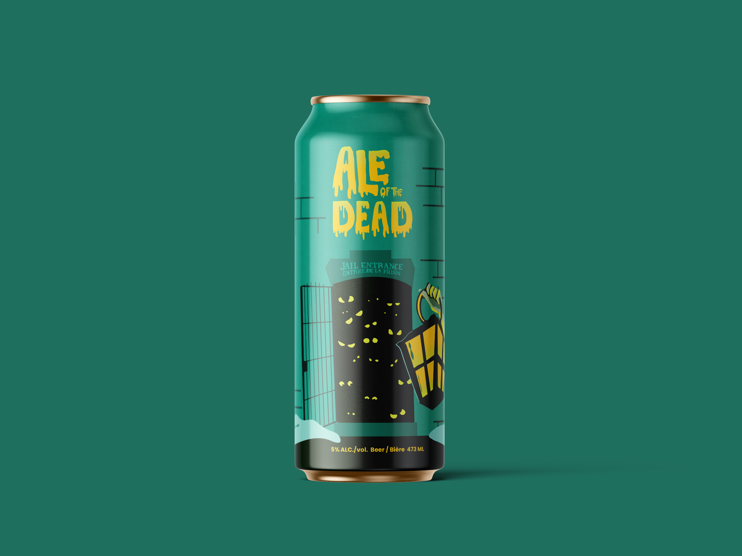
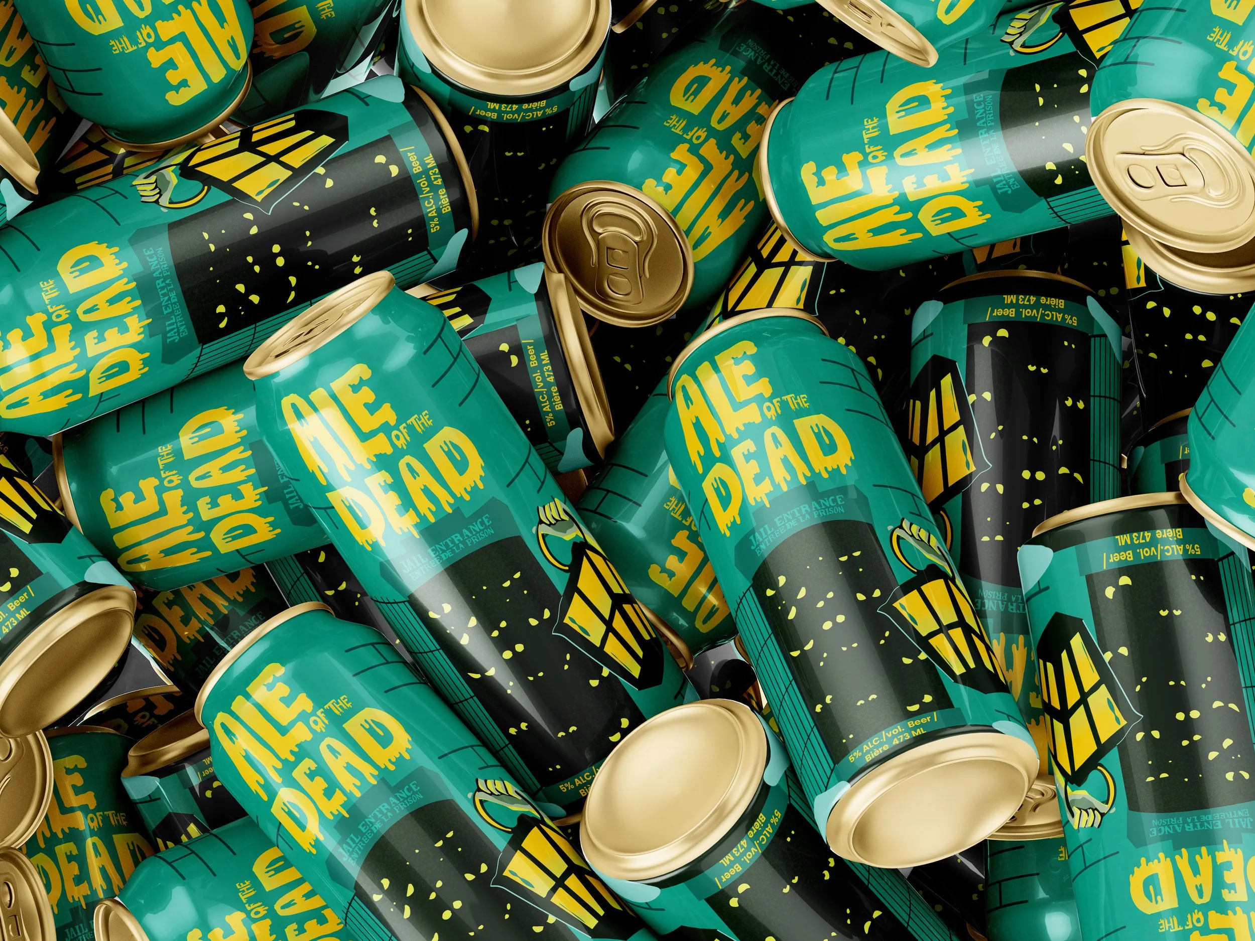
Ale of the Dead
This Halloween-themed concept draws from the Ottawa Jail Hostel and the city’s haunted history. The design leans into darker tones, expressive typography, and illustrative elements to create a playful yet eerie atmosphere, offering a dramatic contrast to the brewery’s standard clean and restrained look.
Both concepts aim to strengthen the connection between product and place while experimenting with tone, colour, and illustration.
Development
Using Dominion City’s branding as a foundation, I explored more detailed illustration styles, bolder colour combinations, and expressive typography to differentiate each concept. Layouts were tested to balance storytelling with functional packaging requirements, including ingredient panels, barcodes, and legal information.
Multiple iterations were created to refine composition, improve hierarchy, and ensure readability at can scale, while still maintaining strong shelf presence.
Revisions & Iteration
These designs represent an early direction rather than the final outcome. Through in-class critiques and feedback from my professor and peers, I was able to identify areas that needed improvement and refinement. In the Ale of the Dead concept, the original door illustration was replaced, as the first version felt too compact and visually compressed. Similarly, in the Mind the Locks concept, the initial colour choices and composition were not fully working and required adjustment.
This stage of the process was essential for narrowing down the strongest direction and resolving visual issues before moving forward into the next phase of development.

Final Design
The final designs present two distinct visual directions that remain rooted in Dominion City’s identity while expanding its creative range.
Mind the Locks offers a calm, architectural interpretation of Ottawa’s waterways, while Ale of the Dead delivers a bold, atmospheric narrative inspired by local folklore. Together, they demonstrate how illustration and storytelling can be used to evolve a brand’s visual language without losing its authenticity.
These concepts showcase how packaging can function not only as branding, but as a storytelling medium that connects consumers to place, history, and experience.